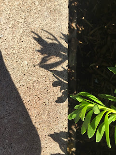
4. The photo that showed the color green in the right bottom corner of the picture changed my view on photography. It changed my view because it the green color brings out color, and we were "forced" to have a certain color in the picture and at a certain corner.
5. Shape is a closed line that is two dimensional and can show length and width, and form is three dimensional that can show length, width, and depth.
Shapes: http://clarissalandandbeyond.blogspot.com/2015/02/elements-of-art-shapes.html
Form: http://clarissalandandbeyond.blogspot.com/2015/03/elements-of-art-form.html
6. Pattern is a repeating of an object or symbol on the work of art, while repetition is an object or symbol that makes the work of art seem active.
Pattern: http://clarissalandandbeyond.blogspot.com/2015/03/principles-of-design-pattern.html
Repetition: http://clarissalandandbeyond.blogspot.com/2015/03/principles-of-design-repitition.html
7. Weebly Page: http://clarissalandandbeyond.weebly.com/about.htm
Inspiration's About Page: http://www.stephaniegracelimphotography.com/#!about
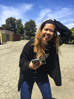
8. Final Project (Laughter): http://clarissalandandbeyond.blogspot.com/2015/06/period-4-final-project.html
Nails: http://clarissalandandbeyond.blogspot.com/2015/05/commercial-shoot.html
First Commercial Shoot (Free Spirit): http://clarissalandandbeyond.blogspot.com/2015/05/first-commercial-shoot.html
I think the Free Spirit was the best because we were able to pose like the models in the pictures, we were able to make the advertisement look similar. This project changed me by showing me that the photographer has to work with the models to get the correct feeling. Also, it was hard to get the correct lighting. I learned to see differently by being able to create the same picture, but different from the original, and when we went out to take pictures.
To Clarissaland and Beyond!
Wednesday, June 10, 2015
Friday, June 5, 2015
Period 4 - Final Project
Temperature: 0
Tint: 0
Exposure: +0.40
Contrast: +28
Highlights: -23
Shadows: +38
Whites: +39
Blacks: -33
Clarity: 0
Vibrance: 0
Saturation: 0
Temperature: 0
Tint: 0
Exposure: +0.95
Contrast: -28
Highlights: -100
Shadows: -17
Whites: +33
Blacks: -36
Clarity: +28
Vibrance: 0
Saturation: 0
Temperature: 0
Tint: 0
Exposure: +0.20
Contrast: -16
Highlights: -2
Shadows: +22
Whites: +36
Blacks: -44
Clarity: -23
Vibrance: 0
Saturation: 0
Temperature: 0
Tint: 0
Exposure: -0.15
Contrast: +40
Highlights: -20
Shadows: +25
Whites: -65
Blacks: -38
Clarity: +16
Vibrance: 0
Saturation: 0
Temperature: 0
Tint: 0
Exposure: +0.15
Contrast: +26
Highlights: -28
Shadows: +37
Whites: +37
Blacks: -35
Clarity: -3
Vibrance: 0
Saturation: 0
Friday, May 29, 2015
Student Website Reviews
Period 1: Cassie Shu
I think the best picture was the one with the girl being blown into the air by the whale. I think it's the best picture because she made it look like the whale is using its blow hole to propel her into the air, and it's creative.
Period 2: Serena Lightstone
I think the best picture was the of the sunset on the mountainside. I think it's the best picture because of the colors, and the lines of the mountain are defined.
Period 3: Pavi Bhatter
I think the best picture was the of the spaghetti. I think it's the best picture because the colors go well together, and everything is symmetrical.
Thursday, May 21, 2015
Presentation Project
Temperature: 0
Tint: 0
Exposure: +0.90
Contrast: +8
Highlights: +17
Shadows: -46
Whites: -52
Blacks: -68
Clarity: 0
Vibrance: 0
Saturation: 0
Temperature: 0
Tint: 0
Exposure: +0.40
Contrast: +45
Highlights: -27
Shadows: +69
Whites: -100
Blacks: -48
Clarity: 0
Vibrance: 0
Saturation: 0
This picture shows Frankie's joy of nails and nail polish. |
Temperature: 0
Tint: 0
Exposure: +0.65
Contrast: -3
Highlights: -13
Shadows: -7
Whites: -100
Blacks: -45
Clarity: +18
Vibrance: 0
Saturation: 0
Temperature: 0
Tint: 0
Exposure: +0.40
Contrast: +33
Highlights: -78
Shadows: +35
Whites: +41
Blacks: +8
Clarity: 0
Vibrance: 0
Saturation: 0
Temperature: 0
Tint: 0
Exposure: 0
Contrast: +30
Highlights: +76
Shadows: +17
Whites: +20
Blacks: -46
Clarity: +1
Vibrance: 0
Saturation: 0
Friday, May 8, 2015
Wednesday, April 29, 2015
Mr. Farley's Photoshoot
Original
Edited - Camera Raw
Temperature: 0
Tint: 0
Exposure: 0
Contrast: +34
Highlights: -20
Shadows: -33
Whites: +73
Blacks: +28
Clarity: -7
Vibrance: 0
Saturation: 0
Thursday, April 23, 2015
Best Photo
Swim Meet At UC Berkeley |
5 Photographers' About Me's
Ashley Maxwell Photography
Alex Noriega Photography
Stephanie Grace Lim Photography
Stephanie Hogue Photography
Christine Szeto Photography
Subscribe to:
Posts (Atom)